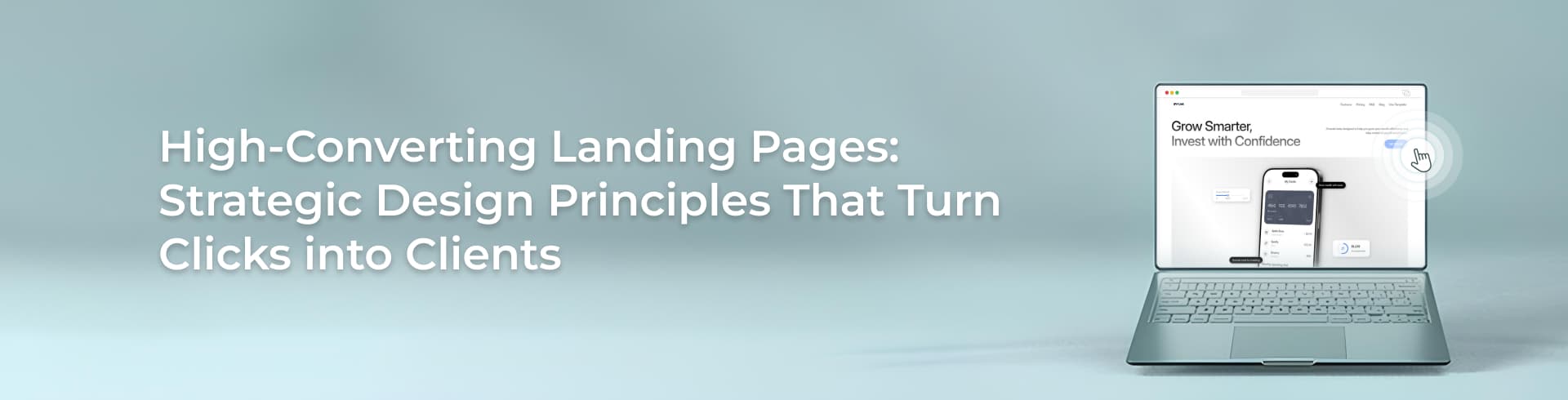
Immersive Website Design: Lessons from Building UAE Destinations
Immersive website design, as we practise it at Element8, means building a website that behaves like the destination it represents — a digital place visitors explore, navigate and use, rather than a page they read. The most useful lesson we can offer comes from a decision we made early in the Yas Bay project. The site we inherited spoke to investors. The people actually arriving at it were looking for a night out in Abu Dhabi. So we rebuilt the entire experience around them — a 3D wayfinder map instead of corporate copy, live Instagram feeds on the homepage, an events hub covering everything from New Year celebrations to music parties. No single feature made that website immersive. The decision about who it was for did, and everything else followed from it.
Our team has now designed and built destination websites for three of the region’s most ambitious retail and entertainment projects: Reem Mall in Abu Dhabi, Yas Bay on Yas Island, and Saadiyat Island for Miral Experiences. This article is a field report from those builds — what we actually scope when a client asks for an “immersive” website, the decisions we wrestled with, the tradeoffs we accepted, and, just as importantly, where we now tell clients that immersion is money badly spent.
What “immersive” actually means when you have to build it
“Immersive” may be the most abused word in our industry. We have sat in pitch meetings where a parallax scroll was called immersive, and others where nothing short of a full WebGL world would satisfy the brief. Both extremes miss the point. Our working definition, sharpened across the Reem Mall, Yas Bay and Saadiyat projects, is this: a website is immersive when it performs a job the physical destination performs. A mall helps you find a store — so did the wayfinder we built for Reem Mall. A waterfront makes you feel the buzz of the place — so does the introductory video and live social feed on Yas Bay’s homepage. If a feature does not map to something the destination itself does for its visitors, it is decoration, however technically impressive.
That definition is deliberately technology-neutral. Through our immersive 3D web experience practice we work with Three.js, WebGL and Babylon.js, and we build everything from 3D product configurators to browser-based space planning tools that render smoothly without plug-ins. We like this technology. But on all three destination projects, the hardest problems were never rendering problems. They were questions of audience, language direction, content operations and page weight — which is why this article spends most of its time there.
The Immersion Stack: the four layers we scope on every destination build
When a destination brief lands on our desks, we scope it as four layers. We have come to call this the Immersion Stack internally, and the order matters: each layer only works if the one beneath it holds.
- Layer 1 — Foundation: bilingual architecture and a performance floor. English/Arabic delivery and mobile speed are not features in the UAE; they are the ground the site stands on. Reem Mall’s bilingual interface and Yas Bay’s mobile-first optimization were both Layer 1 decisions made before any creative work began.
- Layer 2 — Orientation: spatial navigation and wayfinding. Every destination has geography, and visitors think spatially — what is near what, where do I park. Reem Mall’s brand wayfinder and Yas Bay’s 3D map both live here.
- Layer 3 — Atmosphere: motion, video and visual language. The introductory video on Saadiyat’s site — a visual appetizer, as we described it in the case study — and the wave motifs that carry the island’s identity through every page.
- Layer 4 — Liveness: content operations that keep the destination feeling open. Instagram integration, event publishing, promotions. The layer clients most often forget to budget for, and the one that decides whether the site still feels immersive a year after launch.
Here is the pattern we see constantly: clients want to buy the stack from the top down — “we want a 3D experience” — while we insist on scoping it from the bottom up. A spectacular Layer 2 map on a site with no Arabic experience and a ten-second mobile load is not immersive. It is a demo. The three sections that follow unpack the layer that dominated each project.
Reem Mall: making a wayfinder work in two directions
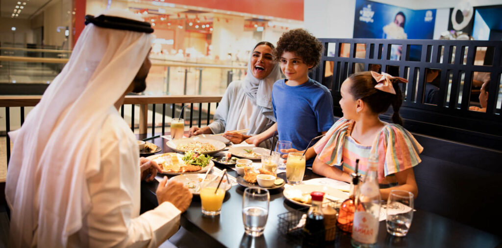
Reem Mall came to us as a full engagement — website development, UI/UX design, the wayfinder, and SEO and content strategy — for a destination showcasing brands like Ray-Ban, Zara and Mango. The core job was obvious the moment we mapped visitor intent: help me find the brand I came for. That pointed straight at interactive wayfinding, and it forced the first big decision of the project.
The problem: a conventional store directory — an alphabetical list with floor numbers — technically answers the question, but it makes the visitor do the spatial reasoning themselves. The constraint: the site had to serve a bilingual audience through a single coherent interface, because reach across Arabic- and English-speaking visitors was an explicit goal of the build. The decision: we built the wayfinder as a navigational tool in its own right rather than a content page — select a brand, and the site guides you through the mall’s layout. We describe it as a digital compass, and the phrase is doing real work: a compass is something you use, not something you read.
The tradeoff nobody warns you about: the moment your website becomes a tool, its data becomes operational. A directory page with a wrong entry is an embarrassment; a wayfinder with a wrong entry sends a family to the wrong end of a mall. Tenants change, units move, promotions rotate. This is precisely why our engagement with Reem Mall did not end at launch — we manage regular updates on an ongoing basis so the site remains a dynamic and accurate reflection of the mall. When we scope wayfinding for any client now, the maintenance commitment goes into the conversation on day one, because a wayfinder you cannot keep accurate is worse than no wayfinder at all.
Then there is Arabic. We hold a firm position here, and it is one of the clearest markers we see separating premium UAE destination sites from the rest: RTL is a design problem, not a translation problem. Right-to-left layouts mirror the entire visual hierarchy — navigation order, iconography, which side of the screen motion enters from, the direction in which a map interface is naturally scanned. Interactive features are exactly where naive translation breaks, because left-to-right assumptions get baked into interaction patterns, not just strings. Our bilingual workflow now wireframes Arabic layouts alongside English from the first sprint, and our UI/UX team in Dubai prototypes interactive components in both directions before a line of production code is written. Retrofitting RTL onto a finished interactive build is one of the most expensive mistakes a UAE destination can make.
Saadiyat Island: content operations are the product, not the afterthought
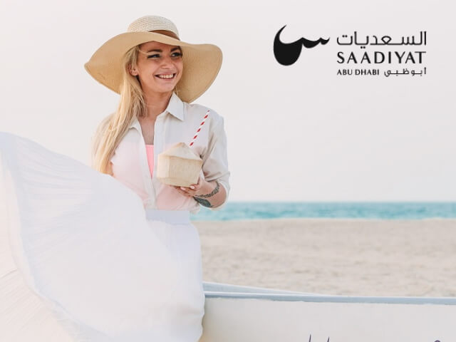
The Saadiyat Island brief, for Miral Experiences, contained the most honest challenge statement of the three projects: the website had to do more than provide information — it had to convey the experience of visiting the island, for audiences as different as international tourists, cultural enthusiasts and food lovers. You cannot solve that brief with features alone. You solve it with editorial decisions, and then you keep solving it every week the site is live.
Two decisions defined our approach. First, we compressed the island’s sprawling offering into three visitor jobs — Stay, Dine and Explore — and built the layout around them with strong imagery. This is the discipline we push on every destination client: your information architecture should mirror the questions in a visitor’s head, not the org chart of the venues on your land. Second, we let the island’s own identity do the atmospheric work: an introductory video that immerses visitors in the atmosphere before a single word is read, and a visual language of sleek lines and wave motifs drawn from the serene beaches themselves. Atmosphere built from the destination’s real character ages well; atmosphere built from stock trends dates within a year.
But the part of the Saadiyat build we now weight most heavily in scoping conversations is liveness. The site integrates Instagram stories directly on the homepage — real glimpses of the island as it is today, not as it was photographed at launch. Yas Bay works the same way, with live Instagram updates feeding the homepage, and its events hub presents everything from New Year celebrations to music parties in a creative format that has made the site a central point for event information. Reem Mall’s site, likewise, operates as a central hub for promotions and events with regular updates keeping it relevant.
Here is the opinion we defend in every destination pitch: a destination website dies the moment it feels out of date, and most immersive budgets are spent as if launch day were the finish line. Immersion is not something you launch; it is something you run. The Saadiyat site became a digital gateway to the island — attracting visitors from around the globe and contributing to increased tourism and online engagement — not because of any single launch feature, but because the experience stays current. When we scope Layer 4 now, we scope an operating rhythm: who publishes events, how feeds are moderated, what gets refreshed seasonally, and who owns it after launch. If a client cannot fund that rhythm, we tell them to descope a launch feature and fund it. Every time.
Yas Bay: the richness-versus-performance argument, settled in the client’s favour
Yas Bay was the project where the tension inside immersive website design became unavoidable, because we wanted everything at once: a 3D wayfinder map that changes how visitors explore the island’s attractions — a digital concierge at your fingertips — plus an introductory video, live social feeds and a constantly changing events programme. Every one of those elements adds weight. And the audience context was unforgiving: this site gets used on phones, on the move, by people deciding where to go tonight — which is why it was optimized for mobile from the outset.
The problem: spatial 3D rendering, video and live content pull a page toward exactly the kind of heaviness that kills mobile experiences. The constraint: traffic does not arrive evenly — it spikes around major events, when tens of thousands of people reach for the site in the same hours. The decision: we treated performance as part of the immersion, not its enemy. The introductory video was engineered to be fast-loading — and that qualifier matters more than the video itself, because a hero video that stalls on a 4G connection breaks the spell instantly. The infrastructure underneath was built with robust hosting managed by our team, designed to handle peak traffic and assure uninterrupted access during major events, backed by ongoing maintenance and cybersecurity measures. The tradeoff: engineering discipline like this consumes budget that could have bought another visible feature. We accepted that willingly, and we would again — an immersive site that collapses on the night of a New Year concert is worse than a plain one that holds.
The practice we extracted from Yas Bay now applies to every experience-led build we take on as a web design agency in Dubai: set the performance budget before the creative concept, then make every immersive element earn its place inside it. Decide what the page may weigh and how fast it must respond on a mid-range phone; then the 3D map, the video and the feeds compete for that allowance. Run the process in the other order — concept first, optimize later — and “later” becomes a compromise negotiation in which the user always loses. Fast-loading immersion is immersion. Slow-loading immersion is a bounce.
Where immersion is wasted money
Because we sell immersive builds, you might expect us to recommend them universally. We do not, and being candid about this has won us more trust than any showreel. Four situations where we advise clients against spending on immersion:
- When the site’s job is information retrieval. If your visitors come to find opening hours, submit a form or read documentation, speed and clarity are the experience. Wrapping that journey in 3D adds friction to the exact task the visitor came to complete.
- When there is no geography to navigate. Wayfinding transformed Reem Mall and Yas Bay because those destinations have physical layouts visitors genuinely need to reason about. A spatial interface for a business without meaningful space is a metaphor, and metaphors are not worth their page weight.
- When there is no content operation behind it. Live feeds, events hubs and promotions modules are commitments, not features. If nobody will own the publishing rhythm, an immersive site simply decays in higher resolution. Launch-day immersion with no operating budget is the most common failure pattern we see in the UAE market.
- When immersion is aimed at stakeholders instead of visitors. The original investor-focused Yas Bay site is the cautionary tale we cite most: a website can be polished, expensive and pointed at entirely the wrong audience. Redefining who the site served did more for that project than any technology we added afterwards. Research-led UX — journey mapping, prototyping, testing with real users — is what separates immersion that serves visitors from decoration that impresses boardrooms.
Which level of immersion does your project actually need?
This is the decision matrix we effectively walk through in discovery with every client. Levels are cumulative — each assumes the ones below it are funded and solid.
| Immersion level | What it includes | Best suited to | What it demands | Skip it if… |
|---|---|---|---|---|
| Level 1: Foundation | Bilingual EN/AR architecture, mobile-first build, fast performance floor | Every UAE website, without exception | RTL designed from the first wireframe; a performance budget agreed before design | Never — this layer is non-negotiable |
| Level 2: Atmosphere | Fast-loading hero video, motion design, a visual language rooted in the brand’s real character | Hospitality, tourism and lifestyle brands selling a feeling (the Saadiyat pattern) | Strong art direction and disciplined compression; graceful static fallbacks | Your visitors arrive to complete a task, not to browse |
| Level 3: Interactive tools | 2D wayfinding, store/venue finders, configurators, event hubs with live feeds | Malls, retail and mixed-use destinations where “help me find it” is the core job (the Reem Mall pattern) | An operational data commitment — ongoing management to keep the tool accurate | No one will own content and data updates after launch |
| Level 4: Spatial 3D | 3D wayfinder maps, WebGL/Three.js experiences, virtual walkthroughs and product configurators | Large multi-venue destinations and real estate mega-projects with genuine geography (the Yas Bay pattern) | Serious performance engineering, robust hosting for event-driven traffic spikes, premium budget | The spatial layer would be a metaphor rather than a navigation aid |
Two honest notes on reading this table. First, most UAE businesses that ask us for Level 4 actually need an excellent Level 2 or 3 — and a well-executed lower level beats an underfunded higher one every time. Second, where Level 4 is genuinely justified — spatially complex destinations, property developments sold off-plan, products that benefit from being rotated and configured — it is transformative, which is exactly why our 3D web experience practice exists as an end-to-end capability, from conceptualization to roll-out.
What we would do differently today
A field report that claims no regrets is a brochure. Looking back across these three builds, here is what our team would change if we started them tomorrow:
- Put RTL prototypes in front of Arabic-speaking users even earlier. We design bilingual from the first wireframe now, but testing mirrored interactive components — maps, filters, carousels — with native RTL readers early in prototyping catches directional assumptions that internal review misses.
- Scope the content operation as a product roadmap, not a maintenance line. Ongoing management served Reem Mall well, but we now frame Layer 4 for every client as a publishing calendar with named owners from the kickoff meeting — because the operating rhythm, not the launch, is what keeps a destination site alive.
- Bring venue operations teams into wayfinder planning sooner. The people who manage tenants and events hold the data a wayfinding tool depends on. The earlier they are in the room, the more sustainable the tool’s accuracy becomes.
- Set the performance budget before the moodboard. Yas Bay taught us this; we now apply it universally. Creative ambition negotiates with the performance budget — never the other way round.
- Treat the intro video as a system, not an asset. Compression tiers, lazy loading, connection-aware delivery and a considered static fallback belong in the specification, not in post-launch optimization.
FAQs
What is immersive website design?
Immersive website design turns a website into an interactive experience rather than a static page — using interactive wayfinding, motion and video, live content feeds and spatial 3D where justified. Our test at Element8: the site is immersive when it performs a job the physical destination performs, such as guiding a visitor to a store.
Does an immersive website need 3D or WebGL?
No. 3D elements like the Yas Bay wayfinder map are powerful for spatially complex destinations, but immersion comes from the whole experience: intuitive navigation, atmospheric video, fresh content and fast performance. Many highly effective immersive sites — Saadiyat Island among them — rely on crafted motion, video and live content rather than full 3D environments.
Why does Arabic RTL matter so much for immersive websites in the UAE?
Because right-to-left design mirrors the entire visual hierarchy — navigation, iconography, the direction a map is scanned — not just the text. Interactive features are exactly where translation-only approaches break. We wireframe Arabic layouts alongside English from the first sprint, since retrofitting RTL onto a finished interactive build is far more expensive.
How long does an immersive destination website take to build?
In our experience delivering UAE destination projects, a full experience-led build — strategy, bilingual UX, design, development of features like interactive wayfinding, and testing — spans several months rather than weeks. Timelines depend on feature scope, content readiness and stakeholder approvals, so a discovery phase that fixes scope early pays for itself.
What does an immersive website cost to run after launch?
Plan for an ongoing operating rhythm, not just hosting: event and promotion publishing, social feed curation, wayfinder data updates, and maintenance and security. As with Reem Mall and Yas Bay, ongoing management is what keeps the experience accurate and alive — we advise clients to fund it even if it means descoping a launch feature.
If you are planning a website for a retail, entertainment or mixed-use destination in the UAE and want a straight answer on which level of immersion your project actually justifies, we are happy to walk you through the same scoping we used on these builds. Talk to Element8’s Dubai team for a no-obligation consultation.