Responsive Web Design Dubai
One common query we get from most of our dubai based clients when we say that we specialize in RWD is… what is RWD ?? The below article explains what it is and how you can benefit from using a RWD website.
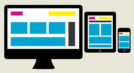
Responsive web design (often abbreviated to RWD) derives its name because it is responsible for its views in any devices, starting from monitors, tablets, mobile phones and so on, it provides an optimal viewing experience for the users. Responsive web design “responds” to their environment. A site designed with RWD uses CSS3 media queries, to adapt the layout to the viewing environment, along with fluid proportion-based grids and flexible images.
From mobile browsers to tablets, users are visiting sites from an ever increasing array of devices and browsers. To adapt to these needs of varying screens, Web version came up with an idea of Responsive web design, that uses flexible layouts that adapt to almost any screen.
Usually, standard way of designing websites has traditionally been to create different versions of your website for tablets and smartphones, meaning that you may create a standard website that is intended for desktop computer viewing, a tablet website that is optimized for devices like the iPad and Android tablets, and a smartphone microsite that is optimised for devices like the iPhone and Nexus smartphones, etc.
But now, with the newer trend of responsive web design, however, a web designer can simply tweak the existing website using just CSS (adding, removing and modifying elements along the way), to create different versions of a website or blog without changing the content.
In conclusion “Responsive web design represents a fundamental shift in how we’ll build websites for the decade to come.”

