5 Reasons to Upgrade Your Website to Responsive Design
The internet is a constantly evolving space of information. From the nascent days of the World Wide Web and its wealth of personal sites and static pages, user interactivity has increased exponentially. One major paradigm shift was the rise of mobile Internet use. However, the web design trend of the mobile site has led companies to develop what is essentially two websites. Enter the concept of responsive design, defined by Wikipedia as an “approach to web design aimed at crafting sites to provide an optimal viewing experience.” With responsive web design, the same website can adjust its elements to fit the device displaying it. There are several benefits to upgrading your website to responsive design, as listed below.
1. You won’t have to make and maintain several formats of the same website.
The first mobile users were beset by webpages meant to be viewed on a monitor with a browser, resulting in formatting issues that could make the website un-viewable. Therefore, web designers would make a separate version of the same site for use on mobile devices. This provided a better experience for the mobile user, but required more time, effort, and money from the web developer.
With responsive design, the same website can be reliably viewed on both a computer monitor and a mobile device, eliminating the need to have essentially two separate websites. With the fluid grid elements of responsive design, there is no need to create separate browser and mobile websites. On that end…
2. You will save money and time.
Expanding on the above, by developing only one site, you will save the costs of having to develop two sites. By using responsive design you can pay to develop only one site rather than worry about the cost of developing and maintaining two. This will naturally save time, which, as the old saying goes, is money.
3. Your website will be better optimized for search engines.
Having separate browser and mobile sites presents another problem: lack of uniformity. Both websites will have different URLs yet essentially be the same site. This will inevitably divide traffic between both sites. With responsive web design, you can achieve uniformity in your site for both browser and mobile users, allowing more web crawler efficiency. The singular URL will also work wonders when it comes to search engine optimization.
4. Your website will serve all visitors more efficiently.
Even if you do use the “separate mobile site” approach, visitors might still bypass it through accessing the full site accidentally. Moreover, someone might provide a link to the mobile version of the site to someone using a browser. Problems such as these are solved via responsive web design, which eliminates the need for these two separate formats.
5. You will better be able to adjust to the changing internet.
The internet is increasingly being accessed via smartphone. As stated above, however, simply having a mobile site is not enough. Consolidating your website to be both browser and mobile-friendly will ensure that your website remains flexible for any changes in the web design paradigm.
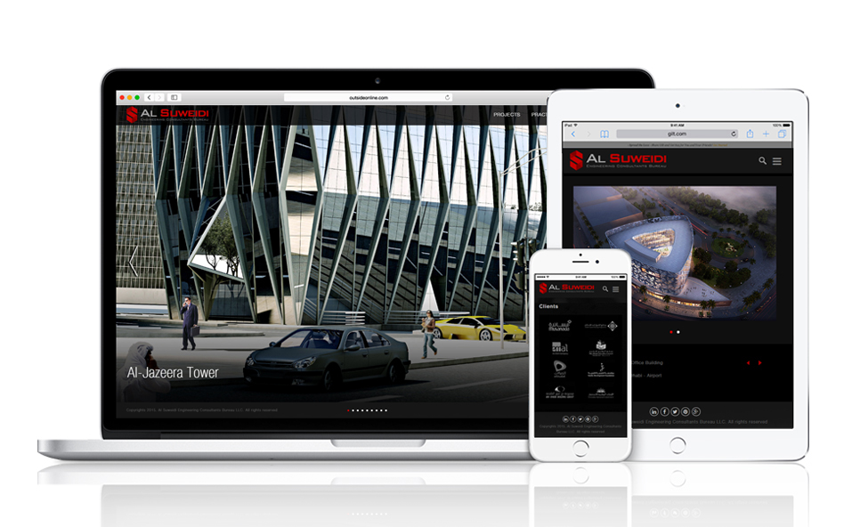
Visit our portfolio page for latest responsive designs.

